Shortly after launching Thomas Pruitt Builders in 2003, Tom Pruitt started work on “The Sunrise,” a newsletter intended to introduce his company to 200 or so past clients from a previous employer. “A newsletter sounds great in theory, but it took a lot to put together,” says Tammy Morris, office manager of the Charlotte, N.C., company. Even with the help of a graphic designer, Morris and Pruitt spent months writing copy and reviewing drafts.
“The Sunrise” had some strengths; see our marketing critic’s comments below. But it was time-consuming for a small company and it failed a basic design test. “We were told that it was too much to read,” Morris says. A graphic designer called it “horrible.”
The designer advised ditching the newsletter in favor of four-color, oversized postcards featuring dramatic makeovers and “just a bite” of copy. Far simpler to produce than the newsletter, the postcards mail quarterly and drive traffic to the information-rich www.thomaspruittbuilders.com.
The newsletter cost $1,100 to design and print, not counting Morris and Pruitt’s time. Each postcard costs $800.
Here’s what Ruth Lozner, an associate professor of marketing at the University of Maryland, has to say about the two formats.
Before “The paper quality is a good, substantial stock. The glossy finish makes the color photographs (not shown) richer and deeper, and will keep the paper ‘clean’ for longer. Use the colors more. Make the headlines yellow or simply underline them in yellow to break up the type blocks.”
“The type is too large and feels a bit cramped. A reduction in size would still be legible. The content is helpful and informative. The short bio (not shown) of the principal establishes confidence in his business values and principles of excellence. The testimonial (not shown) personalizes the company and emphasizes its customer-friendliness.”
“The pull-out boxes are a practical way to highlight interesting tips that do not fit into articles.”
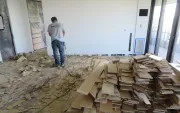
After “The high-quality, full-color photos exemplify the saying ‘a picture is worth a thousand words’ — in contrast to the text-heavy, two-color newsletter. But the ‘ before‘ pictures, which are vital to the story, should be bigger to make a dramatic point.”
“Remove the distracting logo from the background. Instead, show a smaller version of the logo next to the ‘visit us’ line.”
“The ‘from-to’ headline could be interpreted as changing the classic house into the contemporary house.”
“On the back side (not shown), eliminate the distracting logo from the background and repeat the URL for emphasis. For a personal touch, print a short note from Thomas Pruitt, with his signature.”