Choosing a paint color from the swatch wall at a home improvement store is like trying to see the hidden image in a Magic Eye puzzle. If you squint just right and let your eyes go fuzzy, something interesting might pop out. Is it a butterfly or a dolphin? Grayish blue or greenish gray? For 2015, numerous brands have chosen colors of the year they hope will help you uncross your eyes and see new possibilities for your walls and your lifestyle.
Remixed Mauve
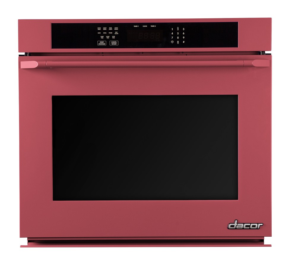
The design world has jumped on Pantone’s announcement of Marsala as its Color of the Year. Bendheim Glass offers marsala back-painted glass for decorative partitions, and appliance manufacturer Dacor added the deep mauve to its ColorMatch program for appliances. “Marsala is a rich, warm accent color for any kitchen,” says Dacor president Steve Joseph. “The wine-infused earthy hue is luxurious, appetizing, and pleasing to the eye.”
Tropical Warmth
The team at Sherwin-Williams chose Coral Reef as its color of the year to reflect the country’s current optimistic outlook thanks to a rebounding economy, says director of color marketing Jackie Jordan. “It’s one of those bright, fresh, beautiful colors that makes you smile,” Jordan says. “And you can pair it with so many colors to make it very exciting or very calming.”
Beguiling Green
Guilford Green’s natural brightness earned it a spot as Benjamin Moore’s 2015 Color of the Year. The hue is versatile, able to stand as the main color for a room, or settle into the background to support other design options. “We were very intent on choosing a Color of the Year that was on-trend, but that is also relatable,” says Andrea Magno, color and design expert for Benjamin Moore. “There might be a color in fashion that’s very bold or vibrant, so you choose it for a sweater or a bag, but with paint this is something that a homeowner is going to have on their walls not just for a year, but maybe for five years or more.” Choosing colors with longevity will help the room stay relevant over time.
Cool Complement
Devine Color founder Gretchen Schauffler creates palettes for her clients around a concept of “trend-proof colors” that won’t be ousted by the next color of the year. “I’ve been in over 3,000 homes and no one ever says, I really think I should have that trendy color of the year,” she says. “What they will say is, ‘my house needs to be refreshed,” or, “I need to make sure my house looks updated.’ Everyone wants to feel current without being trendy.” To that end, Schauffler named Devine Pond the brand’s “hardest-working color” of 2015 because it complements whites, grays, blues, and a range of other colors that may already be in clients’ homes. Adding splashes of Pond lets her clients refresh their interiors without repainting the entire space – unless they want to.
Tropical Seascape
Not all the color in a room happens on the walls. At the Robert Allen Group, a fabric design firm, Calypso Blue was chosen as the color of the year based on votes from the design community. “Calypso Blue is a vibrant color with bold, inky undertones,” says director of fabric design Hannah Alderson. “It represents where design is headed in the coming year, a reinterpreted twist on a classic shade, and we’re excited to see how designers use it in their interiors throughout 2015.”
Bright and Bold
Like Robert Allen Group, ProTect Painters put the Color of the Year question up for a vote, asking more than 15,000 interior design experts to name the “definitive” 2015 Color of the Year. The democratically chosen Blue Paisley from PPG Pittsburgh Paints’ Voice of Color program came out on top with more than 74% of the vote. (Coral Reef and Guilford Green, mentioned above, were also on the docket.) PPG’s national color marketing manager Dee Schlotter says the company is “experiencing the popularity of an energetic blue shade across all markets, such as home décor, automotive, and electronics.”
Steel the Show
As part of its Live Your Moment collection designed to inspire and empower, Dutch Boy named Coal Blue its 2015 Color of the Year for its confident intensity. If your clients are concerned about using a dark color on the walls, the company recommends painting the trim in a paler shade of the same color to frame the wall, and choosing a complementary color for furnishings and accessories.