Architect Sarah Susanka was one of the first to articulate the concept of a smaller house that is tailored to a resident’s lifestyle. Her successful book, The Not So Big House, offers language to define the feeling created by a cozy and well-designed house. Susanka says remodelers and designers need to start by looking at what is not functioning in an existing space. “Homeowners think they need to add a 12-foot-wide addition across the back of the house. But they end up living in the addition, and the old space is unusable,” she says. The not-so-big house has more practical living space. “It’s more tailored to the way you live and has a more human scale,” Susanka explains.
Remodeler Tom Moore is encouraging his customers to follow the same basic design principles. He believes so strongly in the idea that he built a concept home so his customers can see and feel a small, detailed space. The model, in Underhill Center, Vt., has built-in armoires, storage systems, coffered ceilings, raised paneled walls, parquet floors, and archways — all of which showcase the detailed work of the Tom Moore Company.
Susanka’s series of Not So Big House books and Moore’s model home offer examples of great design in small spaces.
Remodelers can achieve the same balance in their designs by thinking about the details — and specifically by taking advantage of views and light, using proper proportion, considering flow and site lines, opening up rooms to multiple uses, and incorporating fine finishes.
Rooms with a view
When working in a small space, don’t just consider the one room that is the project; consider the balance and scale of the whole house. Susanka says the most common mistake designers make is incorrect proportion. For example, she says a large addition with a high ceiling will not match a smaller existing house. “It has none of the crafting and care and detailing and scale as the rest of the house,” she says.
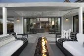
The opposite is also possible — some designers include a claustrophobic-feeling addition that is boxed into smaller rooms. Susanka suggests creating a space that has expansive views. “If you can see from one corner to the opposite corner, a house will seem substantially bigger,” she says, even if the view is only through doorways.
Designer Meg Minette and project coordinator Matthew Jahns, of Milwaukee-based remodeling company Bartelt Filo, suggest creating a floor plan with a few connected smaller spaces. “Make sure there is a view from a smaller space into a bigger space,” Minette says. The view will make the room feel comfortable. So will keeping focal points in scale and keeping windows clear of obstacles.
Instead of using a wall as a barrier, Minette recommends using a bookcase, an entertainment center, or a fireplace to divide spaces. “You can peer around it, and it adds dimension,” she says. Minette also likes to use other visual cues to show a change in area, such as ceiling treatments or changes in flooring or wall materials. “You get a different feel in each section because material or furniture or color has changed,” she says. “It works as long as the change is not abrupt.”
Remodeler Joseph E. Jackson reconfigured the layout of a small barn to create a warm, open house. The owner of Faust Contracting in Monmouth, N.J., brought in light and space by adding only 300 square feet to the footprint. He tucked a 12-foot-square, windowed tower that protrudes 6 feet from the faccedil;ade into the house. At the base of the tower is the new front entry. This allowed him to open up the walls on both sides of the stair that lead up from the foyer.
Arturo Sanchez of Art-Harrison Design in Birmingham, Mich., says fixing a poor layout will open up a small space more than an addition will. To create a larger area, he prefers to steal small bits of space by shrinking adjacent rooms, shifting hallways, and removing closets.
Architect Eric Jenkins says many designers think opening up a small space will make it appear larger, but they also need to consider the room’s uses. “If you make it too open, there is no escape from the openness and no privacy.”
The Washington, D.C.-based architect is a professor of architecture at Catholic University and teaches those principles to his students. His own home is a living example of his lectures. Jenkins divided his 1,000-square-foot house into two spaces. One is the entertainment and living space with a great room used as a dining room, living room, library, and music room. The closed “service” areas include the bathroom, kitchen, bedroom, and closets. He moved the stairway from one side of the house to the center to provide a divider.
Light bright
Sanchez says adding light is the best and most cost-effective way to make a small room feel larger. The kitchen of his tiny 900-square-foot house used to be cut off from the rest of the house by a 30-inch-wide entryway. He removed the entry wall and replaced the adjacent exterior door with a mullioned door that floods the stairs to the lower level with light. To take advantage of the light in the kitchen and add more storage, he removed a side wall that butts up against the cabinets and extended the row of cabinets almost to the mullioned door. “I was able to add another 3 feet to the kitchen,” he says. He angled the countertop and end cabinet to provide a smoother path to the kitchen.
To divide his living room from the upper bedroom and bath without cutting off the flow of light, Jenkins designed a wall of shelving with movable horizontal planes. “It’s like a louver blind. You can turn the panels and change the amount of light,” he says.
In a recent row house kitchen remodel, San Francisco designer Peggy Deras added a 12-inch bump out with a window to bring in sunlight from an adjacent window well. Not only did it add light but the bump-out added the illusion of a large space without adding much square footage to the floor. “It visually widens the room,” says the owner of Kitchen Artworks.
Though interior designer Elaine Spero likes adding light to small spaces, she cautions against too many skylights. “People forget they only bring in light during the day. They’re just a hole in the ceiling at night,” says the owner of Elaine Spero Custom Decorating in Rumson, N.J. Windows, she says, usually provide enough light. She suggests following the angle of the sun in the area where a skylight could be installed to see if it will add light at the right times. Tiny, powerful lights that blend into a ceiling are a good alternative, she adds.
Underfoot and overhead
Designers say the height and treatment of the ceiling and floors are crucial in a small room. In kitchens, for example, Susanka suggests dropping a soffit that lines up with the edge of the countertop around the upper cabinets. “The contrast between the lower and higher ceiling heights creates a sense of shelter around activity areas and makes the rest of the room seem bigger,” she says. That technique, she adds, can be used on any of the ceilings in a house. “You can lower the ceiling in an alcove or use a soffit around an eating area,” she says.
Sanchez says generous 10-foot ceilings can still feel intimate if designers add a tray ceiling treatment. “It adds height and interest,” he says.
For an above-the-garage remodel, Minette and Jahns of Bartelt Filo only had 728 square feet to fit in a home theater, office, and exercise room. Because the homeowners didn’t want to change the roof lines of the house, two sides of the room had to have 4-foot-high walls while the center of the room had a height of 9 feet. The duo added two 5-foot-wide barrel vault dormers that add volume to the room. “The curves added softness that gave the volume substance and character,” Minette says. To preserve the open feeling while separating the three areas, the designers didn’t hang doors in the 3-foot-wide openings and left them open instead.
Spero uses wide moldings to make a ceiling feel higher. “You can take a 4-inch base molding, reverse it, and put it on the wall and then apply crown molding,” she says. Installing picture molding in rectangles on the walls also creates the illusion of height. Chair rails, however, make ceilings seem lower.
In an open kitchen/dining/sitting area of a Boston condominium remodel, Bruce Johnson used a soffit to define the kitchen space without using barriers. The president of Lee Kimball Kitchens also changes the flooring material within a space to define specific areas. Architect Jenkins used three types of flooring to define the zones of his row house: wood, tile, and a sisal carpet.
In kitchen remodels, Deras likes to push back the line of cabinets to create the illusion of more floor space. She has specified 15-inch-deep base cabinets and 12-inch-deep wall cabinets for runs of cabinetry that don’t include appliances. Spero says another trick is to lay flooring tiles or sheets with the pattern on a diagonal.
Go with the flow
To open up his small house, Sanchez purposely opened a view from the living room to the kitchen. He used drawers and cabinets to hide the kitchen clutter, ensuring that the visual flow would remain uninterrupted. He also chose warm pear wood cabinets and a granite countertop and backsplash. Limestone flooring in the kitchen blends with the neutral tones of the living room, but it’s accented with a 2-inch-wide slate border to define the area. “The slate allows the eye to follow the shape of the cabinets,” he says. To continue the lean look, he used long contemporary handles on the doors and drawers. Instead of using crown molding that matches the cabinets, he chose one that matches the rest of the house.
Deras prefers flat panel cabinet doors because they are not as intrusive as raised panel doors. White cabinets are best, she says, because even light-brown cabinets intrude on small spaces. “They tend to jump out at you,” she says.
For that same reason, she steers her clients away from backsplashes with contrasting tiles painted with flowers or patterns. “I try to get them to chose a uniform material that recedes into the wall,” she says.
Jenkins says one of the biggest mistakes designers make is using too many different types of materials. It’s also a mistake not to choose one material that particularly stands out. “For example, they use an equal amount of white wall, wood, and stainless,” he says. Cars and clothing, he says, have a hierarchy of colors. “Suits are primarily black, then accented with a white shirt and red tie. You wouldn’t have an all-red suit. Cars have a primary color, then a secondary color and contrasting trim,” he explains. In his loft remodel, the architect used white walls as the primary focus, a secondary tint in the maple and birch woods, and then stainless steel as an accent.
In small houses, Spero says, designers should use a neutral palette for walls, such as taupe, bisque, and light yellow. “Be careful where you use bold colors,” she says, adding that she likes to save bold splashes of color for accessories.
Rooms for living
In a small space, a single area with multiple uses gives homeowners more value for their money. Susanka says a dining area can also be used as a library or a game room. “All of that works if you start to rethink how it is used in the house. Make sure furniture that is used helps the double duty,” she says.
Moore was inspired by visits to Europe, where multiple-use spaces are common. He says living rooms or offices have pullout beds so the room can be used as a bedroom at night. While he doesn’t go to that extreme in his designs, he finds inspiration in the European design sensibility.
Spero says interior designers can help homeowners and remodelers consider all the uses of the room before beginning the project. For example, sometimes a window is installed on a wall that would be better used to line up the television.
Before adding on, many designers suggest looking to unused rooms, such as a formal living room. “I encourage my clients to take a hard look at the living room that is unused. If they don’t have a family room, don’t add on, look at that living room,” says Deras.
Susanka likes the idea of converting the living room into an “away” room where family members can go for privacy. She says some rooms are unused because they are not in view of the main living area. “If you connect a view from the kitchen to that space, it is more likely to be used.”
Finishing touches
Susanka explains in her book that if you take out one-third of the square footage from a project and put that money into built-ins, details, soffits, and open views, the result will be a space that is more personable, feels at least as big, and will work much better.
Sanchez upgraded to granite for the countertop and backsplash in his kitchen. “When you’re only running 15 feet of granite,” he says, you can pick a material that’s more expensive. He only needed one $26 box of slate for the floor border. “Most people have to do that over three times the space,” he says. He also splurged on nine cabinet pulls that cost $37 each. He compares that to a recent project for a customer where he needed 67 cabinet pulls and had a spending limit of $5 each.
Moore says there is comfort in having a small but richly detailed space. He says if clients can’t afford the details right away, remodelers can complete the basic remodel with an infrastructure ready for finishing touches to be added in a few years.
Not-So-Small Web Site
If you are a remodeler or architect who builds or designs using the principles of the not-so-big house, you can register your company on Sarah Susanka’s Web site, www.notsobig.com. Susanka says homeowners who want to incorporate the not-so-big concept into their homes log on to her site. She cautions contractors and designers to only list their company name if they are serious, as they are likely to receive a flood of calls.
Make the Most Of Storage Spaces
* Install full closet systems. If possible, use drawers.
* Install two closet rods instead of one.
* Install two shelves above the closet rod.
* Use built-in cabinets for audio/video equipment and books, so there is less furniture in the room. Built-ins work especially well for attic remodels with low eaves.
* Look to non-traditional spaces for storage, such as under stairs.
* Provide homeowners with a storage system in the basement so they can de-clutter their living spaces.
* Install kitchen cabinets that run up to the ceiling.
* Use tambour doors to hide appliances and other countertop clutter.
* Install drawers in place of standard base cabinets.
* Instead of a standard lazy Susan cabinet, use full-depth adjustable shelving or look for a “super” lazy Susan that has rotating shelves set on a fixed shelf.
* Take advantage of your cabinet company’s accessories and capabilities.
Meg Minette and Matthew Jahns of Bartelt Filo say connecting small spaces and creating across-the-room views makes a small space feel larger. In this media room above a garage, the duo used barrel vault dormers to add volume and soften the straight lines.