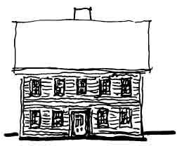
Americans love capes, saltboxes, and other “traditional” house types. At the same time, very few of them want to live a colonial lifestyle. Today’s home buyers demand more open, interconnected spaces than the spaces found in authentically traditional houses. As an architect friend of mine likes to say, Americans really want “contempolonials” — houses that are traditional on the outside but contemporary on the inside. This conflict affects the design process in a number of ways; one of the most apparent has to do with window placements as seen from outside the home.
Conflict Between Front and Rear
If the client wants a traditional centered home shape, the facade that faces the street typically has the expected symmetrical window layout (see Figure 1). But almost invariably, the perfectly centered street-facing windows give way to more eccentric placements at the sides and rear, where large areas may have no glass (think closets, mechanical spaces, food storage, and major appliances), while other areas, such as family rooms and master bedrooms, often give themselves completely over to glass (Figure 2). The result is a visual disconnect between the home’s classically centered public face and the less orderly arrangement of windows at the rear, which is determined by what’s going on within the exterior walls rather than a desire for symmetry.
Figure 1.This sort of symmetrical front elevation worked well in the 1800s, and it’s a look that remains popular today. Window layout provides few problems, as long as the street-facing walls of the front rooms are free of window-obstructing interior elements.
Figure 2.The historically authentic rear elevation of the same saltbox-style house, on the other hand, is poorly adapted to modern lifestyles (left). Today’s version is more likely to look like the drawing at right. The increased glass area makes for a brighter interior, but laying out windows around appliances, closets, and other obstructions results in an awkward-looking, unbalanced elevation.
The Horizontal Connection
Fortunately, there are ways to reconcile these competing interests. One approach — often seen in Arts and Crafts, Victorian, and shingle-style houses — is to set up a dominant horizontal line that serves to unify otherwise scattered window placements. A trim profile that stands several inches clear of the wall, for example, can add a strong visual element that prevents variations in the sizes, shapes, and orientations of adjacent windows from appearing chaotic (Figure 3). Another nice way to incorporate windows into the overall house shape is to make window heads marry with the soffits or fascia at the eaves, thus making a real sense of the “top” of a house. Careful layout and planning are key.
Figure 3.While not perfectly symmetrical, the window placements on the shingle-style house above have a pleasing balance. The windows below the gable peaks are focal points that provide a feeling of “centeredness.” The irregularly spaced windows in the side elevation (right) are visually unified by the use of a strong eaves line and a flared belt course midway up the wall.
Balance, Consistency, and Trim
A nonsymmetrical window layout can sometimes be balanced by using a door or pair of doors as a visual “pivot point.” As long as the windows are arranged in a simple, regular pattern, they don’t need to be centered on a facade to provide a sense of overall consistency (Figure 4).
Figure 4.The symmetrical arrangement of windows in the gable-end portion of this beach-front house is accented by the nonsymmetrical but balanced layout on the wing at left. Grouping windows around the glass doors in the wing provides a strong focal point that acts as a visual counterweight to the expanse of glass at far left.
The windows themselves are another important factor. If the general window type used throughout a given house — such as 6-over-1 double-hungs, cottage-style windows, or fully muntined panes — is rigorously consistent, variations in size and location of the windows become much less distracting.
Finally, have some fun with trim. Playful elements like shutters, flower boxes, and expressed rooflets over the tops of windows can be used as “eye candy” to provide depth and sustain interest. These sorts of elements can also reinforce a focal point created by a window at a front door or at the top of a gable (Figure 5).
Figure 5.An ornamented peak and projecting “rooflet” over the stacked windows adds a sense of unity to a side elevation that might otherwise seem disorganized and chaotic.
Duo Dickinson is an architect in Madison, Conn.