The task: Take an existing kitchen and make it more usable, more beautiful, and more conducive to the homeowners’ lifestyle. The designers of the three projects that follow offer practical solutions that address the functional requirements of a kitchen.
By Nina Patel
Practically Beautiful
Designer: Max Isley, Hampton, Kitchens of Raleigh, Raleigh, N.C.; Size: 256 square feet; Cost: $57,000
Max Isley considers himself a “meat and potatoes” designer. He concentrates on the functional side of a kitchen first, then turns to design details. “You can add incredible trim details with flutes on a base cabinet, but you’re costing yourself storage,” he says. Many designers forget that a concept might be practical in one situation but not in another. “Designers create spaces that are monuments to our egos and design ability and not as functional as they could be,” he says. For example, says Isley, raised dishwashers are a great idea, but some designers forget to create a “landing space” on the counter between the dishwasher and the sink. And sometimes designers force an island into a small space, resulting in an uncomfortable, impractical kitchen.
Isley’s pet peeve is lighting. He says some designers try to brighten a dark kitchen by installing white or light stained cabinets. “But sometimes a new lighting scheme is enough,” Isley says. Although switching from fluorescent to incandescent lighting is often enough to improve lighting in a kitchen, Isley says the aesthetics of a kitchen design are dependent on a good lighting layout. “Your cabinet and countertop can be high quality, but if you have a lousy lighting system, it will die on you,” he says.
Isley has lost projects because he told a client what they wanted was not practical. “I would rather lose a client than put my name on something that is inefficient,” he says.
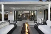
The project: The homeowner is a single woman who is a doctor at the state university. The flow of her 1950s kitchen and the lack of good appliances did not allow her to entertain. She had remodeled the rest of her home and wanted the kitchen to reflect the same style. The original kitchen had bad lighting and an inefficient layout, plus the cabinet doors were delaminating. The client gave Isley a list of appliances she wanted: a wine chiller, microwave, cooktop, refrigerator, and double ovens. Isley carved out room for all of this equipment by stealing 12 square feet from a nearby laundry closet. He replaced the washer and dryer with a stacked unit and put it in the pantry. Isley updated the kitchen with contemporary maple cabinetry, granite countertops, and a stone-look accent backsplash.
Problem 1: The 6-by-4-foot island was too large for the kitchen. It impeded circulation and even made it impossible to fully open the refrigerator door.
Solution: Isley shrank the island to 5 by 3 feet, 3 inches to create better flow. With a smaller island, he was able to widen the original 30-inch-wide aisles to 47 inches in front of the refrigerator and 42 inches in front of the sink.
Problem 2: The sink and range were too close together, with only 6 inches of space between them in a corner of the kitchen.
Solution: Isley separated the new sink from the cooktop with a lazy Susan cabinet. He needed 36 inches for the rotary base cabinet and then added a 33-inch base for the sink. He replaced the original casing on the door with a narrower profile to make room for the dishwasher. “I needed to cheat every inch I could,” he says.
Problem 3: The client is tall and needed higher countertops.
Solution: Standard base cabinets measure 34 1/2 inches high. Isley raised the base cabinets by 1 1/2 inches and ran an extra high toe kick. He says if designers want to install counters higher than this, they should purchase the actual height. Cabinets higher than 1 1/2 inches over standard, he cautions, could affect resale value. He added more storage by eliminating a soffit and installing taller wall cabinets. To save the client from having to bend to reach back into base cabinets, he also added roll-out shelves and a lazy Susan.
Problem 4: High windows in the breakfast nook did not allow diners to see the professionally landscaped backyard garden.
Solution: The original windows in the breakfast nook were 42 inches off the floor. “You could not see out onto the back deck or see the waterfall in the garden,” Isley says. He installed new windows that are 18 inches off the floor. “The new windows make the garden an integral part of the house,” Isley says.
Photo: Charles Harris/SABA |
Problem 5: Though there was a florescent strip over the sink and a hanging fixture over the breakfast table, the main lighting came from fluorescent lights in the base of the skylight well that were shielded by a framework of 18-inch-wide trim. The well for the 3-by-3-foot skylight flared to a 6-foot square over the countertop.
Solution: Isley eliminated the light box around the skylight then added eight recessed cans, including two in the flared well. He used twenty 10-watt lamps for under-cabinet lighting.
Problem 6: Bad circulation and flow didn’t allow for easy entertaining.
Solution: “Angles create movement,” Isley says. The room, however, was made up of straight and perpendicular lines. He chose to place angles where he could all around the kitchen to keep guests from congregating in the kitchen workspace. He cut 45 degree angles on two corners of the granite countertop on the island and the countertop near the wine cooler. Isley also set 2-foot squares of laminate flooring on a diagonal.