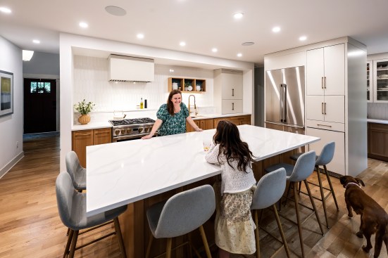
The couple had been dreaming about a bigger kitchen island for months until Michael Anschel, principal of OA Design+Build+Architecture in Minneapolis, asked a simple question: Why did they need more space? The two glanced at each other and started laughing. “You’re right,” one of them said. “That island is just a dumping ground.”
That moment—the gap between what customers think they want and what they actually need—is where the best kitchen remodelers separate themselves from the competition. We talked to five of them in five different markets: Portland, Minneapolis, the Hudson Valley, Chicago’s suburbs, and Tallahassee. What they told us has almost nothing to do with cabinet finishes or fixture trends. It has everything to do with how people actually live in their kitchens, and what it takes to solve problems that no inspiration board anticipated.
Our remodelers identified five trends that reflect what people really want in a kitchen remodel, and offered field-proven guidelines for executing each of them:
1 Look for extra space hiding inside the house
Clients often arrive convinced that a better kitchen is a larger one. They’re rarely right, and the pros we spoke with focus on redirecting them before the design conversation ever begins.
“If you want to add a hundred square feet, I’d rather talk you out of it,” says Paul McManus, president of McManus Kitchen and Bath in Tallahassee. “A small bump-out rarely pencils out. If you want to add square footage, add enough to matter. Otherwise, spend the money inside.”
In Portland, Oregon, Erika Rice of Craftsman Design and Renovation points out that an addition requires excavation, concrete, framing, roofing, and siding trades. “Most of the time, once clients understand that cost, they walk back from it,” she says. Instead, Rice and others remove interior walls, widen entrances, or borrow space from adjoining areas to open kitchens.
Guidelines
–Look inside first. The dining room is the most reliable source of reclaimed space. Dave Pollard of LivCo in Chicago’s suburbs says that the formal room used a few times a year can easily become the kitchen expansion that makes space for an island, a pantry, and better backyard access. “People tried having dinner parties and couldn’t get anybody to go into the dining room anyway,” he says. “They were all hanging around the island.”
–Consider every adjacent space. Unused closets, enclosed porches, and bump-out breakfast nooks are all candidates. Michelle Merck of DBS Remodel in the Hudson Valley recently extended a galley kitchen into an unused master closet. In another project, she squared off an oddly angled kitchen by borrowing space from a pantry closet. The footprint barely changed on paper. The sense of space doubled.
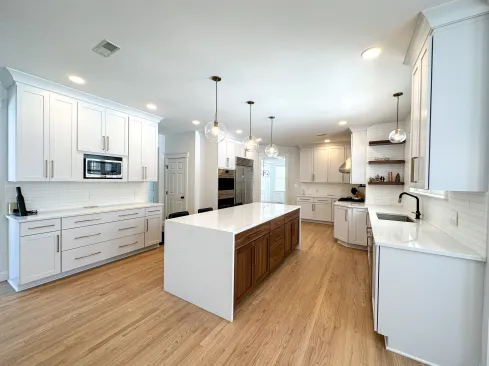
DBS Remodel
Merck removed a wall and reorganized the space, making room for an expansive island while still giving the kitchen a roomy feeling.
–The laundry room is also a good place to steal space. In Tallahassee’s standard ranch layout, the laundry room sits directly adjacent to the kitchen, so McManus asks every client the same question: Do you actually fold clothes in there, or do you carry the basket to the bedroom? “Most people laugh, because they know the answer,” he says. When front-loaders get stacked and the folding counter disappears, that room can become a pantry or just extra space.
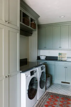
McManus Kitchen and Bath
McManus rearranged the laundry room to create a more efficient space and make room for a pantry.
–Plan for the floor before demo. Merck points out that partition walls are plated to the subfloor, not the finished floor—removal leaves a gap that’s easy to underestimate. Tile from 10 years ago won’t match. Hardwood can be patched but rarely stained to match, which often means refinishing a broader area. Have the conversation before the contract.
–Think beyond the kitchen footprint. The best room reorganizations do more than just add space. “Good design solves two or more problems with one solution,” Pollard says. For example, when Pollard’s clients wanted an island but had no room for one, his team removed the wall between the kitchen and the formal dining room. The change made room for an island, a scullery, and a better sightline to the backyard.
2 Windows aren’t the only way to get more light
Customers ask for more light as often as they ask for more space. “Almost to a T, everybody opens the conversation with ‘I want more light in my kitchen and a better workspace,’ ” Anschel says.
A first instinct is to add windows. But the bigger opportunity is reorganizing the space to let existing light move more freely and strategically using artificial lighting and design tricks to make spaces feel more open.
Guidelines
–Remove upper cabinets before adding windows. Anschel says this will make the kitchen lighter and more functional.
–Widen openings before replacing windows. A widened cased opening brings borrowed light from adjacent rooms into the kitchen.
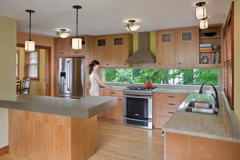
–If the cooktop and range hood are on an exterior wall, consider installing a fixed window between them. Anschel uses this detail to pull light directly onto the work surface in kitchens where windows are limited. It’s unconventional, and it consistently surprises clients with how much it changes the feel of the cooking area.
–Plan the lighting layout before selecting fixtures. Establish general, task, and accent zones first. (For more on establishing lighting zones, see “Kitchen Lighting Design“). Then choose fixtures that serve those zones. Selecting a beautiful pendant and then figuring out where to put it is the wrong order of operations.
–For overhead lighting, McManus prefers recessed LEDs over wafer lights where possible. While wafer lights install regardless of ceiling framing, they sit flush and create glare. An LED recessed 1 to 3 inches into the housing reduces glare and lasts longer because the deeper housing accommodates a heat sink.
–Specify “dim-to-warm lighting.” At full brightness, this type of fixture runs at 3,000 to 3,500 K, providing clean task light for cooking and cleaning. As it’s dimmed, color temperature shifts toward 2,700 K, approximating the warmth of
an incandescent.
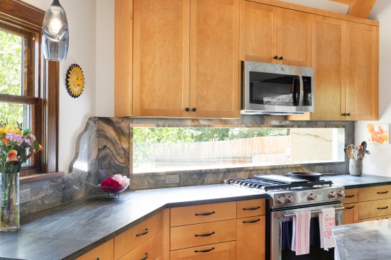
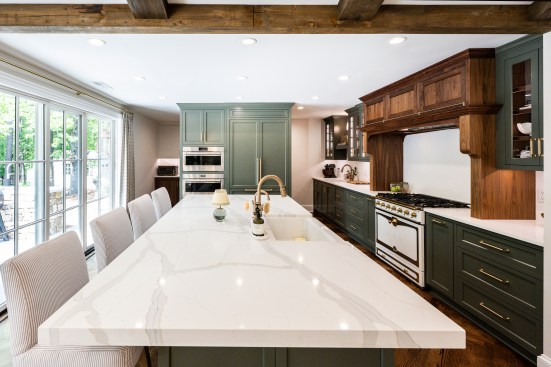
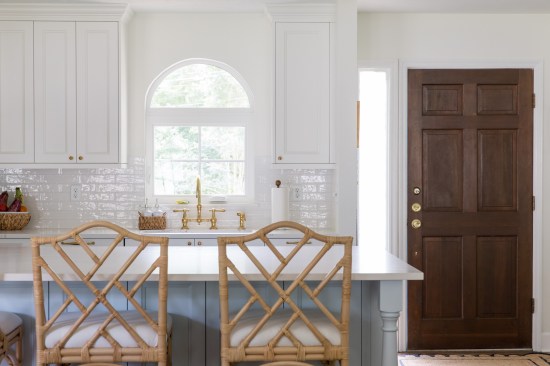
OA Design+Build+Architecture
One of Anschel’s favorite tricks for adding natural light is u…
–Add toe-kick or under-cabinet lighting on a separate switch in open kitchens. When the kitchen is open to the living room, someone grabbing a glass of water shouldn’t have to light up the whole space.
3 Plan for multiple zones and smarter cabinetry
The kitchen work triangle—the mid-20th-century design principle that optimized the path between sink, stove, and refrigerator—has outlived its usefulness. “It was developed in Sweden when people cooked potatoes and kitchens were tiny,” Anschel says. “No restaurant would ever design its kitchen as a triangle.”
What has replaced it? Zone-based design: distinct areas for cooking, prep, cleaning, storage, and increasingly, activities that have nothing to do with cooking at all.
Rather than organizing the kitchen around a single cook’s efficient movement between three points, zones carve out dedicated areas for specific functions—each with its own storage logic, its own traffic pattern, and ideally its own way of being closed off when not in use.
Guidelines
–Interview clients about how they cook before designing anything. Anschel divides cooking styles into two broad types: stovetop-active, where most of the work happens at the burner, and prep-and-slow-cook, where the action is at the counter and then into the oven. Each needs a different spatial logic and a different cabinet strategy. The questions are simple: Are you adding seasonings while you cook or loading a crockpot and walking away? Do you use the stove or the oven more?
–Catalog everything in the kitchen, then question it. The turkey roaster used twice a year doesn’t need to occupy space in a $40,000 cabinet package. Items used a few times a year belong in a pantry, a basement, or somewhere other than the kitchen’s prime real estate. Pollard’s team talks through what goes in every single cabinet and drawer at the concept phase, as well as what height each drawer needs to be.
–Build the capsule kitchen first. McManus starts every kitchen with the same non-negotiables: one or two large drawer banks (30 to 36 inches wide) for pots, pans, and dishes; one narrow multi-drawer unit (18 to 21 inches) near the sink and another near the cooktop for daily-grab items; a trash pullout; at least one tall pantry cabinet. Those go in first. Everything else fills the remaining space.
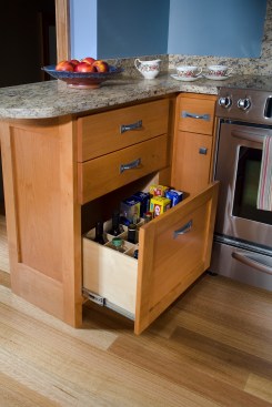
–Convert base cabinets from doors to drawers wherever possible. Clients rarely appreciate how much dead vertical space sits above items piled on the floor of a door-and-shelf base cabinet until a contractor opens one and shows them. Customize drawer heights to match what actually goes in them. A four- or five-drawer bank with modified heights outperforms a standard three-drawer base for small items like utensils, spices, and potholders.
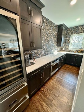
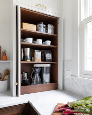
–Keep the beverage and coffee zone outside the cooking work area. The goal is a space guests can access independently—ideally with its own landing surface, a secondary prep sink nearby, and enough distance from the range that two people aren’t crossing paths constantly. Rice recently completed a kitchen where the espresso machine, French press, and microwave all live behind pocket doors in a dedicated zone entirely outside the cooking area.
–Ask whether clients want the zone visible or concealed. A larder cabinet or pocket door cabinet that covers the countertop when closed gives clients the clean look they want for entertaining without sacrificing convenience. Pocket doors stay open most of the time; they close when company is coming.
Correctly detail big range hoods
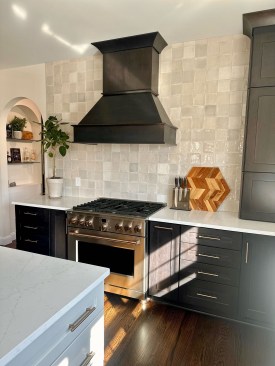
The range hood wall has become an ambitious design statement. Custom hoods anchor the entire room. Think wood, plaster, or tile surrounds that command a wall the way a fireplace commands a living room.
A dramatic hood gives the room a focal point that doesn’t require anything to be clean or put away. “People are really making the hood a decorative piece of the kitchen,” Merck says. “It’s the detail.”
Guidelines
–A large hood needs to be complemented with negative space. Flanking it with equally large cabinet masses makes the wall feel heavy. Flanking it with open shelving, tile, or empty wall space lets the hood breathe and do its visual work.
–When the hood wall eliminates a run of upper cabinets, that storage has to come from somewhere else. Design the compensation before committing to the hood. Options are full-height pantry cabinets on other walls, deep island drawers, or an additional cabinet run where space allows.
DBS Remodel
Merck carved out a beverage zone in this kitchen’s adjacent bu…
–Large hoods above a certain cfm threshold require a makeup air kit—it’s code in many jurisdictions and a genuine safety issue on gas ranges. When the hood activates and depressurizes the house, makeup air prevents flames from being pulled off of burners. Plan for it during design, not during rough-in.
–Vent pipe for a high-capacity hood runs 8 inches in diameter. Getting it to the exterior without a soffit requires knowing where the ceiling joists are before the cooktop location is finalized. Pollard identifies this as another detail that has to be resolved at design.
5 The scullery is a practical upgrade
The open kitchen was supposed to make cooking more social. It did. But it also revealed a flaw. When the kitchen is visible from the living room, the dining area, and the front door, the pressure to keep it looking good is constant. Dishes in the sink, appliances on the counter, groceries waiting to be put away — all of it is on display, all the time.
The answer is the scullery, or butler’s pantry, a secondary kitchen where the real work happens while the main kitchen stays camera-ready. It might be a converted laundry room, a walk-in pantry with a countertop added, or a purpose-built room behind the main kitchen.
And while the main kitchen trends neutral, this space gets bold cabinet colors, patterned tile floors, wallpaper, beadboard, soapstone countertops. The design decisions clients talk themselves out of in the main kitchen can find a home in the scullery.
Guidelines
–Design the scullery as an extension of the kitchen, not a separate room. Pollard’s preferred approach runs the perimeter cabinetry straight from the kitchen into the scullery without interruption, with the refrigerator and wall ovens floating as a visual divider between the two spaces.
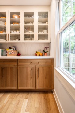
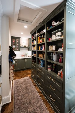
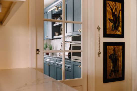
LivCo
Many sculleries are becoming the home for dishes and silverware …
–Manage sightlines. If clients want a separate area, someone sitting at the island shouldn’t have a direct view into the scullery’s open shelving. Alternatively, the glimpse of color and personality from the kitchen into the pantry is something clients consistently love. A doorway without a door maintains the visual connection while keeping the spaces functionally separate. A pocket door that’s kept open most of the time and closed for entertaining gives clients both options.
–Think about function before footprint, Merck says. The minimum viable scullery is a walk-in pantry with a counter added. A good formula: 16- to 18-inch-deep base shelving for bulk items underneath, a counter at working height, and 12-inch shelves above. Grocery bags land on the counter; you unload standing in the pantry instead of making repeated trips between the island and the shelves. Add outlets and small appliances can live and operate there without ever coming into the kitchen.
–Move the dishes. Shifting everyday dishes and silverware into the scullery eliminates one of the most common kitchen traffic conflicts—one family member setting the table while someone else is trying to cook.